Many companies believe that having a modern website is enough to make a good impression and start receiving enquiries. In practice, however, that is not how it works. A website may have an acceptable design, be online, and even look professional at first glance, yet still fail to generate requests, calls, or consistent messages. In many cases, the problem is not only the visual design. It lies in what pushes the visitor away before they even decide to get in touch. That is why, if your company wants to build a stronger foundation from the start, it is worth investing in a well-planned solution such as Custom Website Development for Modern Businesses.
When a business website does not generate results, the issue is often not a lack of traffic. It is a lack of clarity, trust, direction, and consistency throughout the experience. The visitor lands on the website, tries to understand what the company does, quickly compares what they see with what they expected to find, and leaves without taking the next step.
For a broader strategic view, it is also worth reading how to plan a business website that generates leads and clients. In this article, we will focus on understanding what drives clients away from a business website and what can be improved to make the experience clearer, more trustworthy, and more conversion-oriented.
The visitor decides very quickly
One of the most important ideas to understand here is simple: the visitor does not analyse the website with the same patience that the company analyses its own business.
In practice, someone lands on the website and, within a few seconds, starts answering questions such as:
- do I understand what this company does?
- does this look professional?
- can I find the solution I am looking for here?
- is it worth continuing?
- do I feel enough trust to get in touch?
If the answer is “no” or “I am not sure,” the visitor starts pulling away, even if they continue browsing for a few more seconds.
That is why driving clients away does not simply mean “having an ugly website.” It means creating an experience that generates doubt, friction, or lack of interest from the very beginning.
The first factor that drives clients away: vague messaging
One of the biggest problems on business websites is communication that is too generic.
Many companies use phrases such as:
- “We create innovative solutions”
- “We offer tailored services”
- “We develop high-quality digital experiences”
These phrases may sound professional, but they say very little. The visitor still does not clearly understand what the company does, who it works with, and what problem it solves.
Now compare that with something more concrete:
“We create business websites for companies that want to present their services more clearly, build more trust, and generate more enquiries.”
The second version gives context, direction, and perceived value.
When the message is vague, the visitor does not feel confident enough to continue. This point connects directly with the article how to write copy for a business website that generates leads.
When the website does not make clear what the company does
Another very common mistake is forcing the visitor to “discover” what is being offered.
On many business websites, the homepage begins with institutional phrases, abstract slogans, or visual blocks that look modern but do not explain anything objectively.
When that happens, the visitor wastes time trying to interpret the website. And the more effort they need to make just to understand it, the more likely they are to give up.
Ideally, the first section of the homepage should make these points clear straight away:
- what the company does;
- who it works with;
- what the main benefit is;
- what the next step should be.
To go deeper into this, it is worth reading how to create a homepage that leads the visitor to action.
Poorly organised services drive clients away
Even when a company has a good offer, the website can still drive clients away if the services are presented poorly.
This happens when:
- service names are vague;
- pages are too similar to one another;
- there is no clear hierarchy;
- the visitor does not know where to start;
- the offer feels confusing or too broad.
For example, if the website presents blocks such as “Website,” “WordPress,” “Digital Solutions,” “Web Development,” and “Custom Projects,” but does not clearly explain the difference between them, the visitor feels confusion instead of clarity.
A stronger structure usually starts from one main offer, such as Custom Website Development for Modern Businesses, and then expands into more specific solutions such as WordPress Website Development: a Practical and Professional Solution for Companies or API Integrations for Businesses, depending on the client’s need.
This topic also connects directly with how to organise the services on your company website.
Lack of trust also drives people away
Very often, the visitor may understand the offer but still not move forward because they do not trust the company enough yet.
This is especially important on business websites, because the person is not only evaluating a design. They are evaluating whether it is worth starting a conversation with that business.
Some signals that drive clients away include:
- lack of clear company information;
- contact details that are hard to find;
- no proof of work;
- inconsistent design;
- exaggerated or unconvincing copy;
- an unclear process;
- a website that feels improvised.
When the website does not communicate reliability, the visitor thinks twice before sending a message or requesting a quote.
This point is connected with the article what trust elements a business website should have.
Confusing design creates distance
A website does not need to be extravagant to persuade. But it does need to be clear and organised.
When the design includes too many elements, too many colours, weak visual hierarchy, or disorganised sections, the visitor feels confused. Even if they cannot explain the problem technically, they can feel that the experience is harder than it should be.
Some visual issues that drive clients away include:
- too much text without structure;
- headings with no hierarchy;
- visually heavy sections;
- badly placed buttons;
- important elements hidden away;
- a design that feels outdated or inconsistent.
A clean design is not only there to “look nice.” It is there to help the visitor understand and act more easily.
Weak or badly placed CTAs
Another factor that drives clients away is the way the website asks for action.
If the CTA appears too early, without context, or is too generic, the page loses strength.
Buttons such as:
- Learn more
- Click here
- Send
do not always help the visitor understand the value of the next step.
On business pages, something like this usually works better:
- Request a quote
- Talk about your project
- Receive a proposal
- Book a meeting
But the most important thing is not only the wording of the button. It is the context before it. If the website has not yet created enough clarity and trust, the CTA may feel premature or forced.
Friction in forms makes the visitor give up
Many companies lose enquiries because the form creates more resistance than ease.
This happens when the form:
- asks for too much information;
- appears too early;
- feels impersonal;
- does not explain what happens next;
- works poorly on mobile;
- does not build trust.
When the visitor reaches the form and feels too much effort is required, the decision stops feeling simple.
In most cases, a lighter form works better. And more important than the number of fields is whether the visitor understands why it is worth filling it in.
This topic can be explored further in the article why your website forms do not generate enquiries.
Too much information also drives people away
Some business websites try to show everything at once: every service, every argument, every differentiator, the full company story, and several calls to action at the same time.
The result is usually a heavy, unfocused website that is tiring to navigate.
When there is too much information, the visitor:
- loses focus;
- does not know what matters most;
- cannot see the path;
- delays the decision;
- leaves the page.
A more effective website is not the one that says the most. It is the one that says what matters most with greater clarity and in a better order.
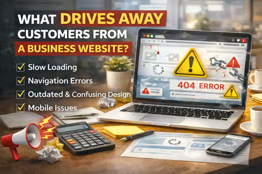
Poor mobile experience drives away an important part of traffic
Even a website that feels acceptable on desktop can still drive many clients away if the mobile experience is weak.
Common problems include:
- text that is too long;
- buttons that are too small;
- forms that are hard to fill in;
- disorganised sections;
- an unclear menu;
- sections that do not adapt well to the screen.
Since many visits come through mobile, any extra difficulty there directly affects conversion.
If the user cannot navigate easily, they lose patience and leave.
The website does not show a clear path
A good business website should guide the visitor to the next step. When that does not happen, navigation feels loose and the user loses direction.
This happens when:
- there is no clear main service;
- pages are not connected logically;
- the visitor does not know where to click;
- the homepage tries to do everything at once;
- there is no logical flow towards contact.
A website that drives clients away is often not aggressively bad. It is simply too diffuse. It does not help the visitor understand the path.
This point also connects with how to structure a business website to generate more enquiries.
Lack of consistency between pages
Another very common problem is when the homepage looks strong, but the internal pages break trust.
For example:
- the homepage feels professional, but the service pages are weak;
- the design changes too much between sections;
- the copy uses very different tones;
- the internal structure feels unfinished;
- some pages are clearly stronger than others.
The visitor does not evaluate just one block. They evaluate the whole experience. And when they notice inconsistency, credibility drops.
The visitor does not feel enough value to move forward
Even when a website feels “acceptable,” it may still continue to drive clients away if it does not show enough value.
In other words, the visitor arrives, more or less understands what the company does, but does not feel a strong reason to act now.
This happens when elements such as these are missing:
- a concrete benefit;
- differentiation;
- examples;
- clarity about results;
- explanation of the process;
- context about what happens after contact.
Without enough perceived value, contact no longer feels necessary.
The most common mistakes that drive clients away
There are very common signs that a business website is pushing potential clients away:
Messaging that is too generic
The visitor does not quickly understand the offer.
Confusing structure
The pages do not help clarify the services.
Lack of trust
The website does not communicate enough confidence.
Cluttered or inconsistent design
The experience feels harder than it should.
Weak CTA
The next step does not feel clear or convincing.
A form with friction
Contact requires too much effort or creates doubt.
Poor mobile experience
The mobile version makes navigation and action harder.
Lack of focus
There is too much information and not enough direction.
How to review what is driving clients away
A practical way to assess this is to enter the website as if you were a new client and ask yourself:
- Do I quickly understand what the company does?
- Do I understand what the main services are?
- Does the website build trust?
- Does the design help or confuse?
- Is the next step clear?
- Does the form feel simple and logical?
- On mobile, is the experience still good?
If several answers are negative, then the problem is not only traffic or the market. It is the experience the website is offering.
Conclusion
Understanding what drives clients away from a business website is essential if you want to fix what is blocking enquiries, requests, and opportunities.
Very often, the visitor does not leave because the company offers a poor service. They leave because the website fails to show that value with enough clarity, trust, and direction.
When the website communicates better, organises the offer better, creates more confidence, and reduces friction, it becomes much easier to hold the visitor’s attention and guide them towards contact.
Final CTA
If your website gets visits but still does not generate consistent enquiries, the problem may not only be in attracting more people. It may be in what the website is communicating — or failing to communicate — in the first seconds of the experience.