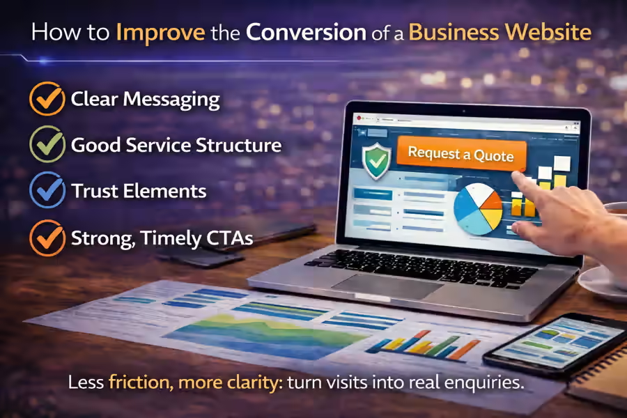
Improving the conversion of a business website is not just about changing buttons, colours, or forms. In practice, it means making the website clearer, more convincing, and easier to use so that the visitor moves naturally towards contact. When a website receives visits but does not generate enquiries, the problem is rarely one isolated detail. Most of the time, it is the combination of message, structure, trust, offer, and user experience.
That is why, if your company wants to turn its website into a more effective channel for generating enquiries and opportunities, it is worth starting with a solid foundation such as Custom Website Development for Modern Businesses.
Many companies have a website that looks acceptable, but still does not produce consistent results. The visitor arrives, browses for a while, reads part of the content, and leaves without filling in the form, requesting a quote, or taking the next step. This happens because conversion does not depend only on being online. It depends on the way the website communicates, guides, and reduces doubt throughout the journey.
For a broader strategic view, it is also worth reading how to plan a business website that generates leads and clients. In this article, we will focus on how to improve the conversion of a business website with practical changes that help turn visits into real enquiries.
What conversion means on a business website
Before improving conversion, it is important to define what it actually means in the context of your business.
On a business website, conversion can mean:
- a quote request;
- a submitted contact form;
- a phone call;
- an email or WhatsApp enquiry;
- a proposal request;
- a booked meeting.
In other words, conversion is not only about “selling online.” On most business websites, conversion means getting the visitor to take the next step with confidence.
When a website does not convert, it usually means that the user did not find enough clarity, enough value, or enough trust to move forward.
Conversion starts before the button
A very common mistake is thinking that conversion happens only at the moment of the CTA. In reality, it starts much earlier.
Before clicking a button or filling in a form, the visitor has already assessed several things:
- whether they understand what the company does;
- whether they found the right service;
- whether they feel trust;
- whether they understood the value proposition;
- whether they see a simple path to contact.
When those stages fail, the click also fails.
That is why improving the conversion of a business website is not only about “optimising the button.” It is about improving the whole path that leads to it.
The first problem: lack of clarity
Clarity is one of the most important factors in conversion.
When someone lands on a website, they want to understand quickly:
- what the company does;
- who it works with;
- what problem it solves;
- what result it can bring.
If the message is vague, too technical, or overly generic, the visitor loses direction. And when direction is lost, the decision is delayed or abandoned.
For example, phrases like:
- “We create innovative solutions”
- “We offer tailored services”
- “We develop high-impact digital experiences”
may sound professional, but still say very little.
Now compare that with something clearer:
“We create business websites for companies that want to present their services more clearly, strengthen credibility, and generate more enquiries.”
This gives direction, usefulness, and intent.
This point is directly connected with how to write copy for a business website that generates leads.
The homepage should guide, not just present
Many homepages fail because they try to say everything at once or, on the contrary, say too little.
The homepage should quickly answer the visitor’s key questions and guide them towards the next step. To do that, it needs:
- a clear value proposition;
- a simple explanation of the offer;
- well-organised sections;
- trust signals;
- a coherent CTA.
If the first section of the homepage does not clearly show what the company does and why it is worth continuing, conversion is already weakened.
To go deeper into this part, it also makes sense to read how to create a homepage that leads the visitor to action.
Services need to be well organised
A business website converts better when the visitor can easily understand what the services are, how they differ, and which one fits their situation.
When services appear without structure, hierarchy, or enough explanation, the user gets lost.
The ideal structure usually includes:
- one main services page;
- individual pages for the main services;
- clear names;
- short but specific descriptions;
- logical connections between solutions.
For example, it makes sense to present one main offer such as Custom Website Development for Modern Businesses and then go deeper into specific solutions such as WordPress Website Development: a Practical and Professional Solution for Companies or API Integrations for Businesses, depending on the client’s needs.
This topic is also directly connected with how to organise the services on your company website.
Trust directly affects conversion
In many cases, the visitor may even like the website but still not get in touch because they do not feel enough confidence yet.
Trust directly affects conversion because nobody wants to leave their details or request a proposal from a company that feels vague, improvised, or unreliable.
A business website builds more trust when it shows:
- a clear value proposition;
- consistent pages;
- a real company identity;
- visible contact details;
- an explained process;
- testimonials or proof of work;
- a clean and professional design.
When these elements are present, the user feels less risk in moving forward.
This point connects with what trust elements a business website should have.
The CTA needs to make sense in context
Not every button helps conversion. Many CTAs fail because they are weak, generic, or appear too early.
Buttons such as:
- Learn more
- Click here
- Send
do not always help the visitor understand the value of the action.
On business pages, something more direct and coherent usually works better, such as:
- Request a quote
- Talk about your project
- Receive a proposal
- Book a meeting
However, a CTA only works when the page has already created the right context. If it appears before there is clarity and trust, it may create resistance instead of action.
The form should reduce friction
Another important point in conversion is the contact form.
Many websites lose opportunities because the form:
- appears too early;
- asks for too much information;
- feels cold or generic;
- does not explain what happens next;
- works poorly on mobile.
In most cases, a simpler form performs better. And more important than the number of fields is the context: the visitor needs to understand why it is worth filling in and what will happen next.
This topic can be explored further in why your website forms do not generate enquiries.
Less distraction, more direction
Some business websites fail because they place too many elements in competition with each other:
- too many different sections;
- several CTAs at the same time;
- repeated information;
- unfocused copy;
- confusing navigation;
- too many options.
When everything is trying to grab attention at once, the visitor loses direction.
Improving conversion also means simplifying. A more effective website usually has:
- a stronger main message;
- cleaner sections;
- less distraction;
- clearer user paths;
- more predictable actions.
In many cases, converting better does not require adding more. It requires removing what is causing confusion.
Mobile has a real impact on conversion
Even a good website can convert poorly if the mobile experience is weak.
Common problems include:
- text that is too long on mobile;
- buttons that are too small;
- forms that are hard to fill in;
- too much scrolling;
- badly organised sections;
- important elements placed too far down.
Since a significant part of traffic comes from smartphones, the mobile version needs to be treated as a priority, not as a secondary adaptation.
A business website that converts well on desktop but poorly on mobile is losing opportunities quietly.
Conversion improves when the process feels simple
Many visitors do not move forward because they fear a complicated process.
If the website does not explain how contact works, what happens next, or what the next step is, the user feels more uncertainty.
That is why it helps to make things clear:
- how the first contact works;
- how long a reply takes;
- whether there is an initial proposal;
- whether the request is just a first assessment;
- how the project usually moves forward.
Small lines like these reduce friction and make the action feel simpler.
Not every visitor is ready to convert immediately
This also matters. Not every person who visits the website is ready to request a quote straight away.
In some cases, the visitor is still comparing options, trying to understand the market, or defining their own need more clearly. At that stage, the website may convert better if it also offers:
- FAQ;
- process explanation;
- related articles;
- work examples;
- clear service pages;
- additional trust signals.
Conversion does not happen only when someone fills in a form. Sometimes it begins when the website helps the visitor mature the decision.
The most common mistakes that reduce conversion
There are very common signs that a business website is losing conversion:
Vague message
The visitor does not quickly understand the offer.
Poorly organised offer
The services feel disconnected or too similar.
Lack of trust
The website does not communicate enough credibility.
Weak CTA
The call to action does not guide the decision well.
Friction in the form
The contact step feels too demanding or confusing.
Cluttered layout
Too many elements compete for attention.
Poor mobile experience
The smartphone version makes navigation and action harder.
Unclear process
The visitor does not know what happens after getting in touch.
How to review the conversion of your website
A practical way to assess this is to enter your website as if you were a new client and ask:
- Do I quickly understand what the company does?
- Can I identify the right solution for my case?
- Does the website build trust?
- Do I see a clear path to contact?
- Does the form feel simple and logical?
- Does the CTA make sense?
- Does the website work well on mobile?
If several answers are negative, then the conversion problem is probably not in one single block. It is in the experience as a whole.
Conclusion
Understanding how to improve the conversion of a business website is essential if you want to turn the website into a real business tool.
When the website communicates clearly, presents services better, builds trust, and guides the visitor without friction, it becomes much easier to generate enquiries. On the other hand, when the experience feels confusing, generic, or too heavy, even a strong service can lose opportunities.
Improving conversion is not only about changing buttons. It is about aligning message, structure, trust, CTA, and user experience so that the next step feels natural.
Final CTA
If your website gets visits but still does not generate enquiries consistently, the problem may not be only the traffic. It may be the way the website communicates, organises the offer, and guides the visitor towards action.