
Organising the services on your company website properly is not just a matter of aesthetics or navigation. In practice, it is an essential part of how your website communicates, builds trust, and generates enquiries. When services appear in a confusing, generic, or poorly grouped way, the visitor takes longer to understand what the company offers and, in many cases, leaves the website without taking the next step.
That is why, if your goal is to present your offer more clearly and turn your website into a more effective business channel, it is worth starting with a solid foundation such as Custom Website Development for Modern Businesses.
Many companies actually have strong services, but they do not present them clearly. Sometimes everything is placed on one page that is too vague. In other cases, several pages are created, but without logic, hierarchy, or context. The result is always similar: the visitor does not quickly understand what the company does, who it works with, and what solution they can find there.
For a broader strategic view, it is also worth reading how to plan a business website that generates leads and clients. In this article, we will focus on one essential part of that structure: how to organise the services on your company website so that it communicates more clearly, improves the user experience, and generates more enquiries.
Why the way you organise services affects conversion
When someone enters a business website, they do not want to “explore” endlessly just to discover what the company offers. The visitor wants to understand quickly whether they are in the right place.
In practice, a good service structure helps the user understand:
- what the company does;
- which solutions are available;
- which service is most suitable for their situation;
- how they can move forward.
When that is not clear, the experience loses strength. The visitor hesitates, browses without direction, and often leaves the website. That is why organising services well is not only a content issue. It is also a conversion issue.
This point also connects with how to improve the conversion of a business website.
The most common mistake: listing services without structure
One of the most common mistakes on business websites is presenting services as a loose list, without order, grouping, or enough explanation.
For example, many companies show blocks such as:
- Website
- Online store
- WordPress
- SEO
- Design
- Marketing
- Automation
At first glance, it may seem like there is variety. However, the visitor still does not understand:
- what the main service is;
- what each option includes;
- what makes the services different;
- which one solves their problem.
When everything is presented at the same level, without context, the website loses clarity. And when it loses clarity, it loses trust and conversion.
Start with business logic, not just the menu
Before deciding how to organise services, it is important to understand one thing: the website structure should not be created only around what the company wants to show. It should be designed around the way the client looks for and understands the solution.
In other words, the question should not only be:
“Which services do I want to put on the website?”
The more useful question is:
“How does the client organise this problem in their mind?”
For example, a client may not be looking for “WordPress development” as their first idea. Instead, they may be looking for:
- a professional website for their company;
- an online store;
- a solution to generate enquiries;
- a clearer and more credible website;
- a practical way to launch or improve their online presence.
That is the logic your structure should be built around.
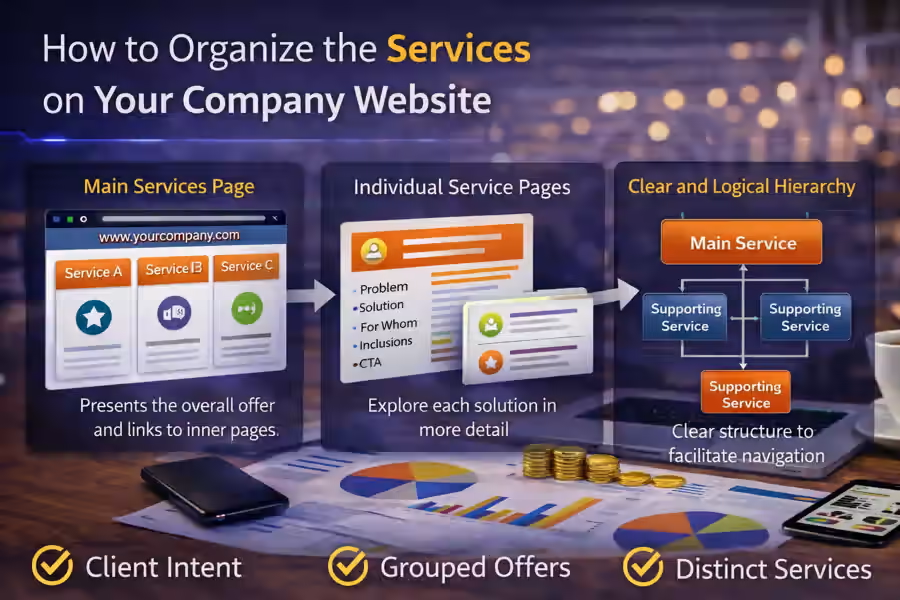
Define one main service and supporting services
One of the most effective ways to organise services is to create a clear hierarchy.
In most cases, the website should show:
- one main service, representing the company’s core offer;
- supporting services, covering more specific needs;
- specialised solutions, when they make sense for certain profiles or scenarios.
For example, a coherent structure can begin with a main offer such as Custom Website Development for Modern Businesses and then branch into more specific pages such as:
- WordPress Website Development: a Practical and Professional Solution for Companies
- WooCommerce Online Store Development
- Professional Shopify Store
- API Integrations for Businesses
This kind of structure helps the visitor understand that there is a main offer, while also seeing solutions adapted to more specific needs.
Organise services around client intent
A service page works better when it follows the intent of the person visiting the website.
In practice, services can be organised in different ways depending on the business. However, one of the most useful approaches is grouping them by real client need.
For example:
1. Services for digital presence
- company website development;
- business website creation;
- website redesign;
- landing pages.
2. Services for online sales
- WooCommerce online store;
- Shopify store;
- product pages;
- checkout optimisation.
3. Services for structure and performance
- website architecture organisation;
- conversion improvement;
- forms and enquiry flow;
- CRM or automation integrations.
This logic is far more useful than a random list of technologies because it helps the visitor find the right solution faster.
Create one main services page and individual service pages
Another important point is to avoid putting everything on one huge and generic page. In many cases, the ideal approach is to combine:
- one main services page, presenting the overall offer;
- individual pages, going deeper into each main solution.
The main services page should help the visitor see the offer as a whole. The individual pages should answer questions such as:
- what the service includes;
- who it is for;
- what problem it solves;
- how it works;
- what result it can bring.
This gives the website more clarity, more depth, and more ability to convert.
What should appear on the main services page
The main services page should not try to explain everything at the same level. It should work as a clear map of the offer.
In general, that page should include:
- a short introduction to the type of services provided;
- the logic behind the structure;
- a clear presentation of each service;
- links to internal pages;
- enough context for the visitor to decide where to click.
For example, instead of writing only “WordPress”, it is much better to say:
“WordPress website development for companies looking for a practical, professional, and easy-to-manage solution.”
Instead of simply writing “WooCommerce”, it is better to present it as:
“WooCommerce online store development for businesses that want to sell online with a flexible and professional foundation.”
The clearer these descriptions are, the easier navigation becomes.
What each service page should include
Each service page should be built to answer a specific need. It should not be just a copy of the homepage with a few words changed.
A good service page usually includes:
1. A clear headline
The visitor should immediately understand what is being offered.
2. The problem the service solves
This helps the user relate to the situation.
3. The solution
This shows the value of the service in a practical way.
4. What is included
This reduces doubt and increases perceived value.
5. Who it is for
This helps qualify the visitor.
6. A consistent CTA
This invites action without feeling forced.
If you want to strengthen this part, it also makes sense to connect it with what trust elements a business website should have.
Avoid creating services that feel too similar
Another common mistake is having several service pages that feel almost identical. This confuses the visitor and weakens the value proposition.
For example, if the website includes pages that are all too close in meaning, such as:
- professional website;
- business website;
- modern website creation;
- custom website development;
but without a clear difference between them, the user does not understand the logic of the offer.
In those cases, the best solution is to:
- merge pages that repeat the same intent;
- differentiate the services that remain;
- clarify the positioning of each solution.
Each service needs to have a clear role in the website architecture.
Show the relationship between services
The organisation of services improves a lot when the website shows how the different solutions connect to each other.
For example:
- a business website page can lead to a WordPress page;
- a website page can lead to API integrations;
- a corporate website solution can evolve into an online store;
- an e-commerce project can begin with WooCommerce or Shopify.
Showing these connections helps the visitor understand that the company has a structured way of thinking and connected solutions, instead of just a loose collection of pages.
Do not organise services only by technology
This is an important point. On many websites, the structure is built from the inside out, based on technology:
- WordPress
- React
- API
- WooCommerce
- Shopify
But the client rarely arrives at the website thinking that way.
In most cases, they are thinking in terms of result, need, or context:
- I need a professional website;
- I need to present my company better;
- I want to sell online;
- I want to generate more enquiries;
- I need to connect systems.
Technology can and should appear, but as support for the solution, not as the only organising logic.
Use short but specific copy
The way services are presented also makes a big difference.
If the blocks are too short and vague, the visitor does not understand enough. If they are too long, the reading becomes heavy.
The ideal balance is short but specific copy.
For example, instead of:
“Professional Web Development”
it is better to say:
“We create professional websites for companies that need to present their services more clearly and make it easier for new clients to get in touch.”
This point is directly connected with how to write copy for a business website that generates leads.
Show what the next step is
Once the services are well organised, it is essential to show the visitor what they should do next.
Each block or service page should help the user move forward naturally. That is why the CTAs need to make sense in context.
Examples include:
- Request a quote
- Talk about your project
- Receive a proposal
- Book a meeting
When both the structure and the next step are clear, navigation becomes much more effective.
Mistakes that damage service organisation
There are very common signs that service organisation is not working well.
Everything feels the same
If all the pages say almost the same thing, the structure is not clear.
Service names are vague
If the visitor reads the title and still does not understand the offer, there is a communication problem.
There is no relationship between pages
When services feel isolated, the experience loses consistency.
The homepage tries to explain everything
When the homepage tries to do the job of the service pages, the website becomes heavy and confusing.
The visitor does not know where to start
If there is no main service or clear logic, navigation loses direction.
How to review the service organisation on your website
A simple way to assess this is to enter your website as if you were a new client and answer these questions:
- Do I quickly understand what the main services are?
- Can I clearly distinguish the solutions from one another?
- Is there a clear logic between the main page and the internal pages?
- Do the service titles help me understand the offer?
- Do I know what the next step is?
If several answers are negative, the service structure probably needs to be reviewed.
Conclusion
Understanding how to organise the services on your company website can make the difference between a website that simply shows a list of offers and a website that actually guides the visitor towards contact.
When services are well organised, the website communicates more clearly, improves the user experience, strengthens trust, and makes conversion easier. When they are poorly structured, even a strong offer can feel confusing.
A more effective business website does not depend only on design or traffic. It also depends on how it presents, prioritises, and explains its services.
Final CTA
If your website presents services in a vague, disorganised, or overly technical way, it may be losing enquiries before the visitor even understands what your company really offers.