
Many companies believe that simply adding a form to the website is enough to start receiving quote requests, messages, and real business opportunities. In practice, however, that rarely happens automatically. A form may be visible, technically functional, and still generate almost no enquiries. In many cases, the issue is not only the form itself, but the whole website structure, the level of trust it creates, and the way the visitor is guided before reaching that point. That is why, if your company wants to improve that foundation from the start, it is worth building on a stronger base such as Custom Website Development for Modern Businesses.
When a form does not generate enquiries, it does not necessarily mean the traffic is weak or the service is not attractive. Very often, the visitor actually reaches the right page, understands part of the offer, but still does not move forward because they encounter friction, doubt, or a lack of trust at the moment they are asked to submit their details.
If the goal of the website is to generate real enquiries and requests, the form should not be treated as just a block at the bottom of the page. It is part of the conversion process. And conversion depends on message clarity, page structure, trust, and the context that comes before the action.
For a broader strategic view, it is also worth reading how to plan a business website that generates leads and clients. In this article, we will focus on why your website forms do not generate enquiries and what can be improved to increase response rates.
A form does not fail on its own
Very often, the form is treated as the main problem. In reality, however, it is only the final point of a journey.
Before filling in a form, the visitor has already made several small decisions:
- they have understood or not understood what the company does;
- they have felt trust or not felt trust;
- they have understood or not understood the value of the offer;
- they have found or not found the solution they were looking for;
- they have felt or not felt safe enough to move forward.
When any of these parts fail, the form suffers the consequences.
That is why, if your form is not generating enquiries, the most useful question is not only:
“Is the form good?”
The better question is:
“Has the visitor reached the form already prepared to act?”
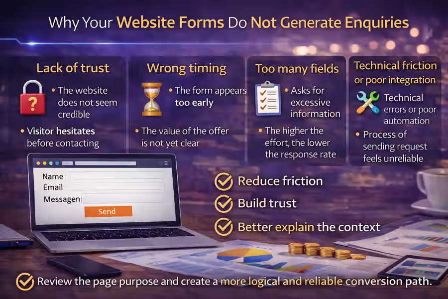
The first problem: lack of trust before the contact moment
One of the main reasons website forms do not generate enquiries is a lack of trust.
If the website does not communicate credibility, the visitor hesitates before leaving their name, email, phone number, or project details. This is especially important on business websites, where the user wants to feel they are dealing with a real, organised, and professional company.
When trust signals are missing, doubts begin to appear:
- is this company serious?
- will they actually respond?
- do they understand what I need?
- is it worth leaving my details here?
- will the process be simple or complicated?
That is why the form needs to sit within a context of trust. This point connects directly with what trust elements a business website should have.
The form appears too early
Another common mistake is showing the form too early, before the visitor understands the value of the offer.
Many pages place a form with several fields right at the top, but have not yet explained:
- what the company does;
- what problem it solves;
- why it is different;
- what kind of help it offers;
- what the visitor can expect after getting in touch.
In that situation, asking for details so early creates resistance.
A form works better when it appears after the website has already created understanding, context, and confidence. In many cases, the ideal order is:
- present the offer;
- explain the problem and the solution;
- reinforce trust;
- only then invite the visitor to get in touch.
This point also connects with how to create a homepage that leads the visitor to action.
It asks for too much information
This is one of the most common problems.
When the form asks for too many details, the perceived effort becomes higher. And the higher the perceived effort, the lower the chance the visitor will move forward.
Many forms fail because they immediately ask for:
- full name;
- company name;
- phone number;
- email;
- sector;
- budget;
- timeline;
- project type;
- detailed message;
- how did you find us.
In some cases, part of this information may make sense. But for a first contact, it is often too much.
In most situations, a simpler form performs better, with fields such as:
- name;
- email;
- phone number, if relevant;
- message.
The simpler and clearer the first step is, the less resistance the visitor feels.
The text around the form does not help
Another common issue is that the form appears on its own, without context or support.
The visitor sees the fields, but finds no clear reason to fill them in. In that situation, they think more about the effort than the benefit.
That is why the form should be supported by a message that answers questions such as:
- why should I fill this in?
- what will I receive afterwards?
- how long will it take to get a reply?
- what is this contact for?
Examples of more useful supporting messages include:
- “Talk to us about your project and receive a proposal tailored to your company.”
- “Briefly explain what you need and we will get in touch to suggest the best solution.”
- “If you are looking for a clearer, more professional website designed to generate enquiries, send us your message.”
When the text around the form is clear, the action feels more natural. This topic connects with how to write copy for a business website that generates leads.
The CTA is weak or too generic
Many forms fail because the action button does not help.
Buttons such as:
- Send
- Submit
- OK
- Continue
are too vague. They do not reinforce value or help the user feel the purpose of the action.
On business pages, something more direct usually works better, such as:
- Request a quote
- Talk about your project
- Receive a proposal
- Ask for a website review
- Get in touch
The button does not fix everything on its own, but it can help a lot when it reinforces the right intention.
The form is not aligned with the page
A form works better when it matches the context of the page where it appears.
For example:
- on a business website page, the form should refer to the project, website, and goals;
- on an online store page, it can focus on sales, catalogue, payments, and structure;
- on an integrations page, it should mention systems, automation, and technical needs.
If the same generic form appears on every page without adaptation, it loses relevance.
On more specific pages, it may also make sense to connect the contact action with the right solution, such as WordPress Website Development: a Practical and Professional Solution for Companies or API Integrations for Businesses, depending on the need being presented.
The visitor still does not understand the value of the offer
If the form appears on a page where the offer is still poorly explained, conversion will usually be low.
Before asking for contact details, the page should help the visitor understand:
- what is being offered;
- what problem is being solved;
- why the solution is useful;
- who the service is for.
Without that, the form feels like a request for effort instead of a logical next step.
This point is directly related to how to organise the services on your company website, because when the offer is badly structured, the form also becomes weaker.
The form feels too impersonal
On some websites, the form feels cold, automatic, or disconnected from the brand.
For example, when the visitor sees only a block with fields and a button, without any sign of proximity, context, or human presence, conversion can drop.
Small elements help make contact feel more natural:
- a more human sentence;
- a simple explanation of what happens next;
- a tone that matches the brand;
- the company identity;
- a visible email or phone number as an alternative.
This reduces the sense of risk and helps the visitor feel that they are dealing with a real business.
The website does not show what happens after submission
Another important reason is that the user does not know what to expect next.
If it is not clear what happens after the form is submitted, doubts appear:
- will they reply?
- how long will it take?
- will I receive a proposal?
- is this only an initial request?
- will they call me straight away?
A small line can solve a lot:
- “We usually respond within 1 business day.”
- “After submission, we review your request and get in touch with the best proposal.”
- “This form helps us understand your needs before suggesting the most suitable solution.”
When the next step is clear, the visitor feels safer.
The form does not work well on mobile
Even a good form can fail if the mobile experience is weak.
Common issues include:
- fields that are too small;
- buttons that are hard to tap;
- a messy layout;
- poorly adapted text;
- too much scrolling;
- difficulty typing on a phone.
Since many visits come from smartphones, the mobile version needs to be clean, simple, and fast.
A form that works well on desktop but poorly on mobile may be losing an important share of opportunities.
There is technical friction or poor integration behind the scenes
In some cases, the problem is technical.
For example:
- the form does not send correctly;
- there are silent errors;
- the user does not receive confirmation;
- the lead does not reach the right email;
- the data does not enter the CRM;
- the flow between the website and internal systems is poorly connected.
When the website depends on CRM tools, automations, notifications, or integrations, the technical side also influences conversion. In those cases, it may make sense to work with API Integrations for Businesses to ensure a clearer and more reliable process.
The form is isolated from the rest of the strategy
A form should not be treated as a separate block disconnected from the website. It needs to be aligned with:
- the value proposition;
- the page structure;
- the copy;
- the trust elements;
- the CTAs;
- the organisation of services.
When the form is isolated, it feels like an attachment. When it is part of a clear strategy, it works as a natural continuation of the visitor journey.
This point also connects with how to structure a business website to generate more enquiries.
The visitor may not be ready to talk yet
This also happens. Not every visitor is ready to make contact immediately.
In some situations, the person is still comparing options, trying to understand the market, or clarifying their own problem. At that stage, the form is not necessarily the ideal next step.
That is why some pages perform better when they combine the form with other supporting elements, such as:
- FAQ;
- process explanation;
- testimonials;
- work examples;
- related content;
- an invitation to request an initial review or guidance.
The problem is not always the form itself. Sometimes the issue is that the form is asking for a decision before the visitor is ready.
The most common mistakes that cause forms to lose enquiries
There are several signs that a form is hurting conversion:
Too many fields
The effort feels too high.
Weak copy
The visitor does not understand why they should fill it in.
Generic button
The CTA does not reinforce value or direction.
Lack of trust
The website has not yet created enough confidence.
Poor context
The form appears before the offer becomes clear.
Lack of alignment with the page
The contact block feels generic and not very relevant.
Mobile problems
The experience on a phone makes action harder.
Weak technical flow
The lead is lost or the process feels unreliable.
How to review the form on your website
A practical way to assess the problem is to look at the form as if you were a new visitor and ask:
- Do I clearly understand what this form is for?
- Does the number of fields feel reasonable?
- Does the text around the form build trust?
- Does the CTA make sense?
- Do I know what will happen after submission?
- Is the experience simple on mobile?
- Has the page already convinced me before asking for contact details?
If several answers are negative, the problem probably is not only the form. It is the way the form has been integrated into the website.
Conclusion
Understanding why your website forms do not generate enquiries matters because, in many cases, the blockage is not caused by one isolated detail. It is caused by the combination of small frictions: lack of trust, too many fields, weak context, a poor CTA, bad mobile experience, or no clarity about what happens next.
An effective form is not just a contact block. It is the natural continuation of a page that has already explained the offer clearly, built confidence, and helped the visitor feel that moving forward is worth it.
When the context is right, the form stops being an obstacle and becomes a simple next step.
Final CTA
If your website gets visits but almost nobody fills in the form, the problem may not be only the traffic. It may be the way contact is presented, explained, and integrated into the user experience.